


Minimalism, less is more with this design style
The design world goes through various trends, and today we're looking at the art of minimalism. Here are some examples of famous movie posters re imagined in this trendy, simple style.
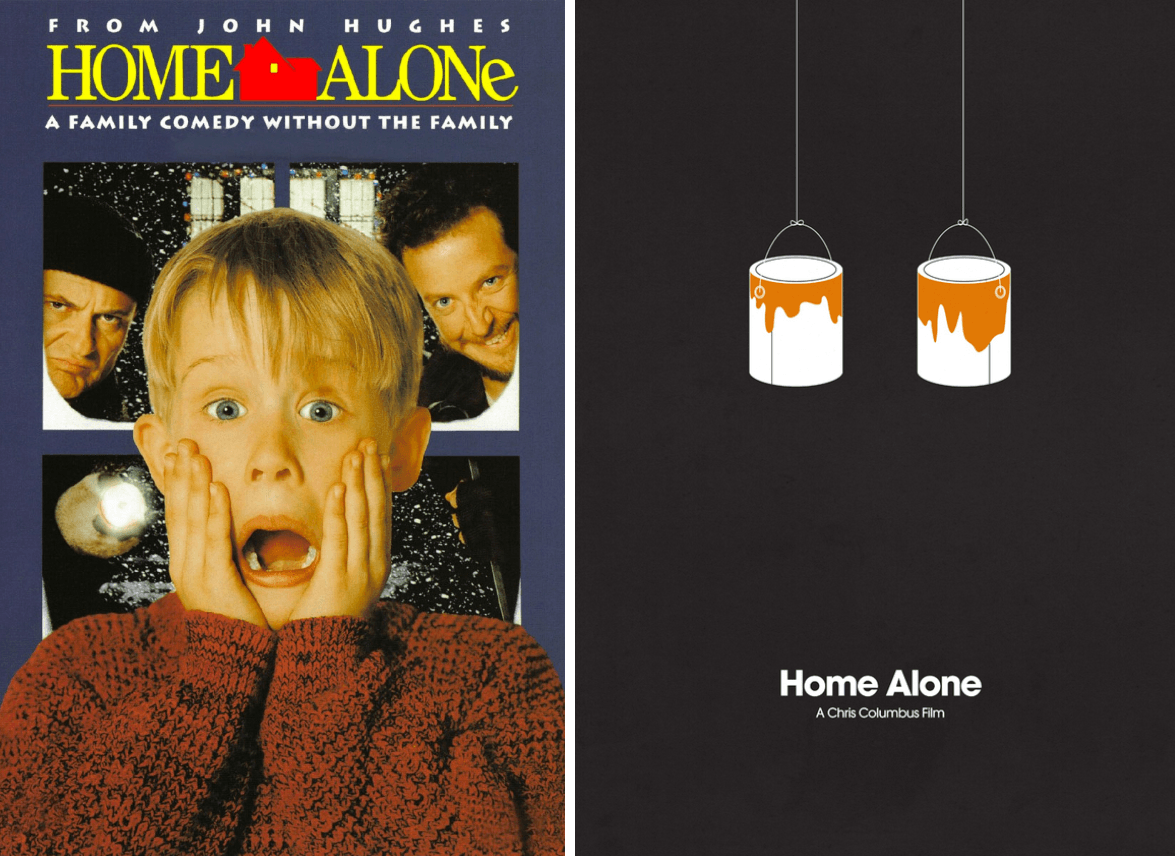
Redesign by Jamie Bolton: The paint tins are homage to the clever pranks set up byMacaulay Culkin’s character. Although this may be obvious to most, as it's a well-known Christmas classic, the design may intrigue a new viewer into wondering what the movie is actually about.
Does it work? Fairly well in our opinion. You could almost forgive someone for mistaking it for a home improvement / DIY poster, but we reckon you'd be unlikely to find many individuals unaware of this famous movie.
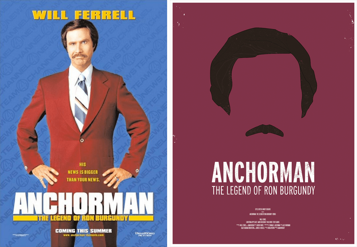
Redesign by Moxy Creative House: The moustache is key, combining with the hairstyle to point to the era in which the movie is set. The simplicity of this design still packs an impressively large punch as we get a sense of the movie setting and anyone aware of the movie can pretty much immediately picture Will Ferrall's face as Ron Burgundy.
Would we have changed anything? We'd perhaps suggest making the background burgundy instead of purple, or even the garish wallpaper from Ron's apartment for further scene setting - but we do like a single colour background.
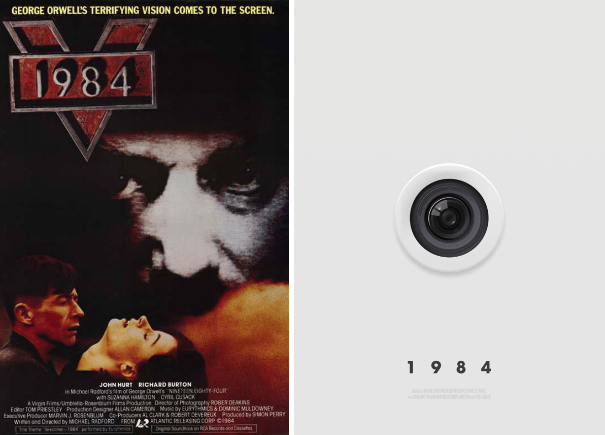
Redesign by Peter Majarich: We get the 'Big Brother' feel by a single camera lense, blending into the white background in a hidden, voyeuristic style depicting the 1984 story. Simple. Clever.
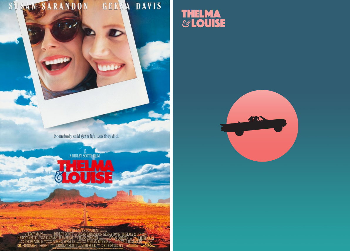
Another Redesign by Peter Majarich: We love how the iconic ending of Thelma & Louise (oops, spoiler!) has been immortalized in this powerful design. Driving off a cliff into the great beyond... it's a nice concept executed very neatly. Love it.
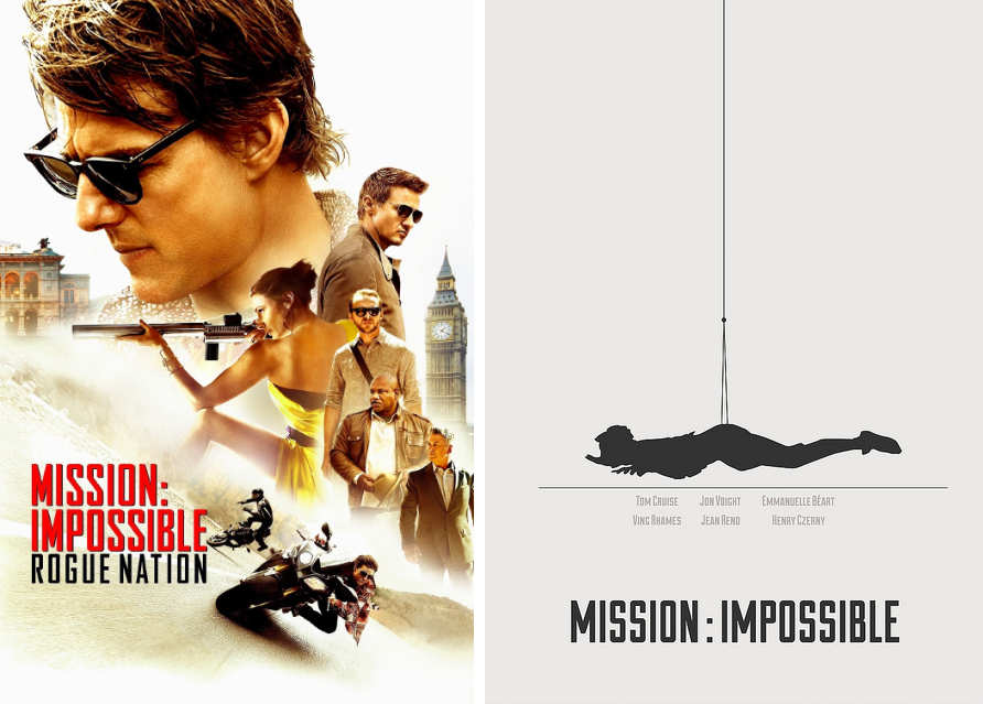
Redesign by H. Svanegaard: Using only black on white, this silhouette portrays arguably the most iconic mission impossible scene. It's so neat and clean yet tells us so much. Although add a hat and we'd be thinking of Peter Pan probably!
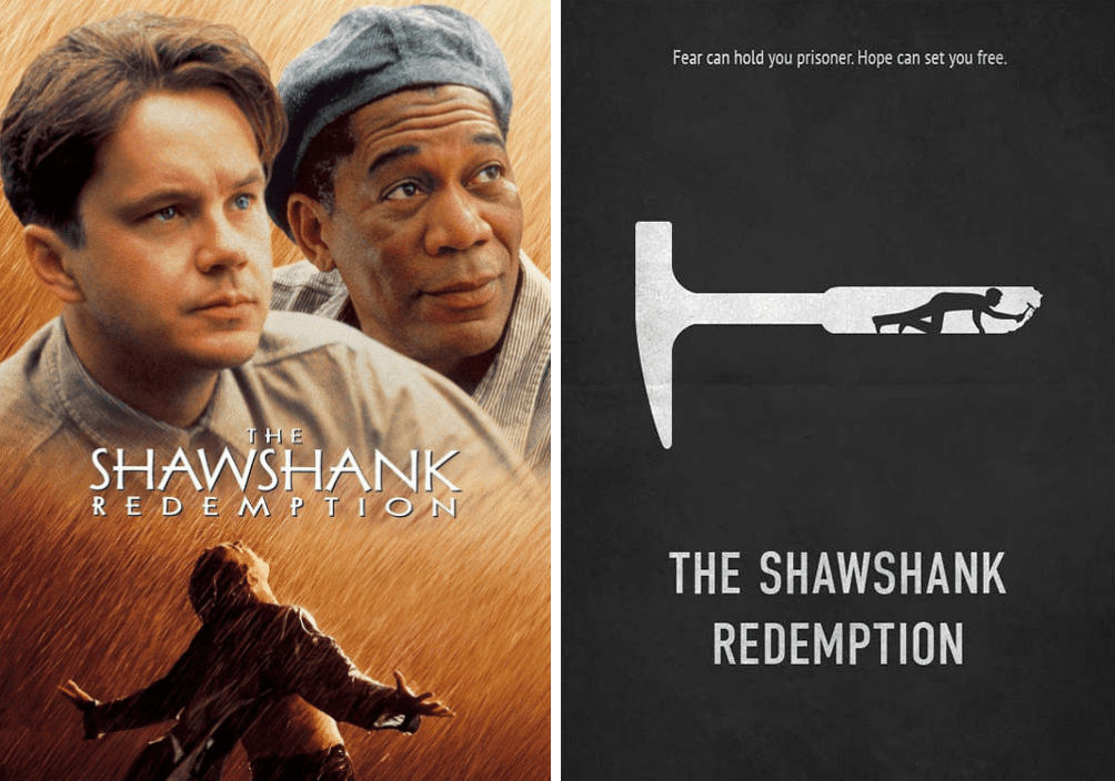
Redesign by E. Novazheev: Double emphasis on the pickaxe. The tagline at the top lets us know the movie is about a prisoner of some sort, and the character digging an escape tunnel inside the shape of the pickaxe works quite powerfully at conjuring up an aspect of the movie.
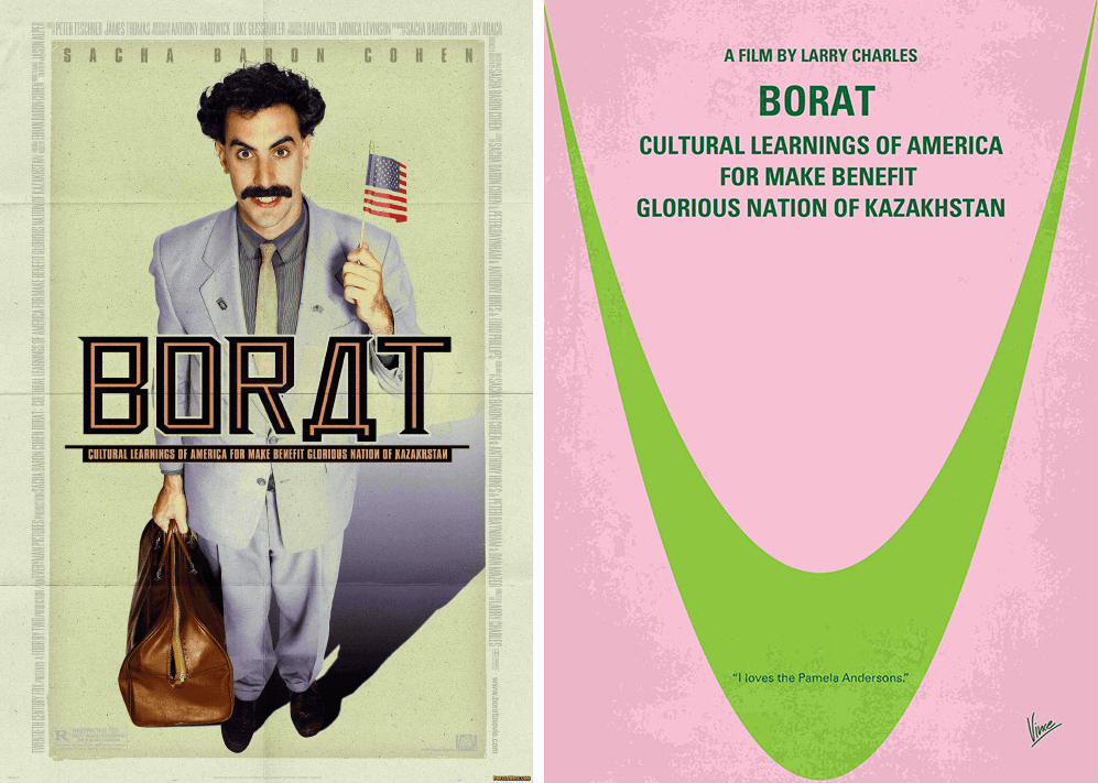
Redesign by Chungkong: And finally, we can't help but chuckle at this cheeky design. The two colours depict the 'mankini' from Borat. The greatness of this design, is how easily it sets the tone of outright wackiness and the general comedic uncomfortable styling of the movie.
So, perhaps less is more!
You don't need a great deal of artistic flare to create your own simplistic masterpiece - just a clever mind!
At our Glasgow office, we offer same day poster printing of multiple sizes. Send us your file in the morning and we can have it ready before the end of the day easily enough!
See more via our dedicated poster printing website: www.glasgowposterprinting.co.uk
Bonus content inspiration: Disney!
Here are a collection of designs by Julien Rico. Disney is such an iconic brand that most of us are well familiar with - we almost feel that these designs are so powerful that they don't need any summary. Have a look, we hope it gets your creative juices flowing!
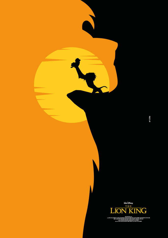
It's that famous scene on Pride Rock!
But... look closer... did you notice the shape of that orange toned daylight? Yep. It's a lion. Two designs for the price of one.
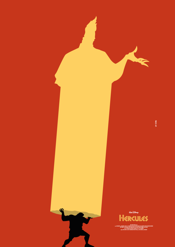
It's Hades. Oh wait, it's also Hercules showing his strength lifting a large column. The design ends with a twist, nice.
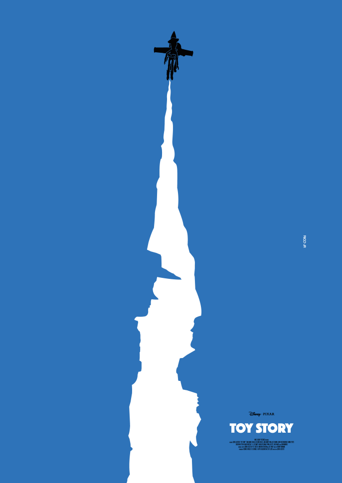
We're sure you noticed it, but we just wanted to applaud the negative space usage here. Notice the character shapes in the rocket trail.
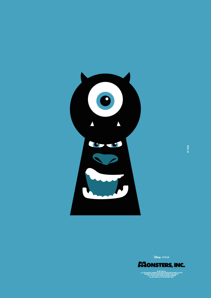
Again, fairly obvious, but the shape the monster faces occupy represents a keyhole on a door.
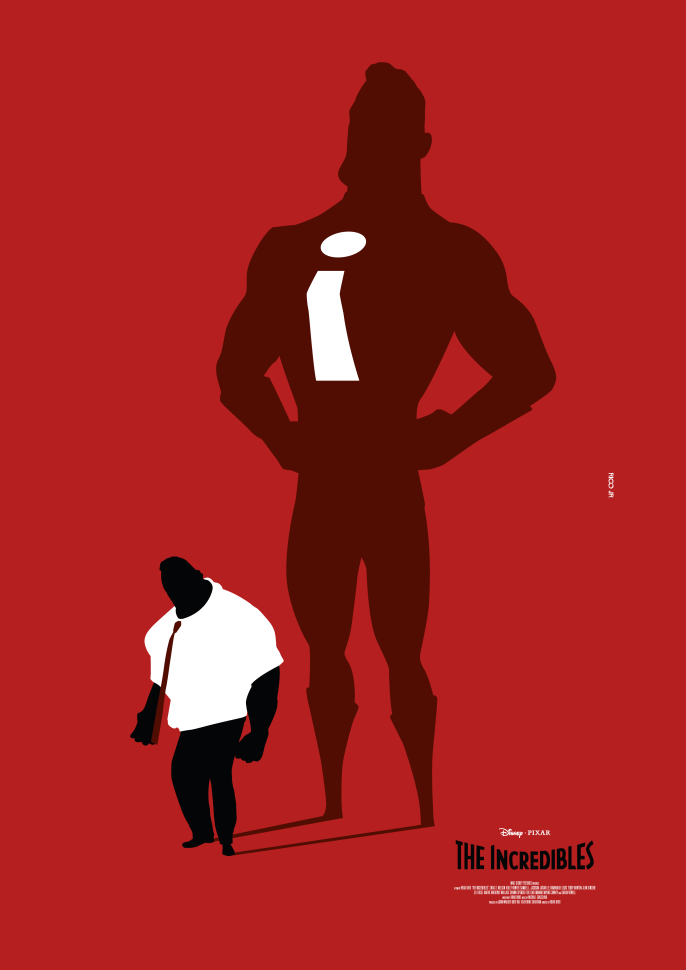
This one is more self explanatory, the ordinary man holds a big secret. Behind him, his shadow displays his true identity as a super hero.
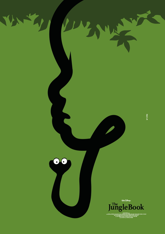
Finally, the snake from the Jungle book takes centre stage here - but again, we can find a hidden face in the design. Following the snakes body, you'll notice some strange twists - especially that little sharp bit... the reason? It's our heroes face and the flick of his hair! Nice.
Also in Glasgow Print + Design Centre Blog

Printing hacks for poetry writers and publishers
Here are a number of things to think about when planning your poetry book. Considering these issues will help keep costs under control. Call them pamphlets, chapbooks or just poetry books the factors that drive the price are the same.

